You want a home that feels cohesive, not chaotic. The 60-30-10 rule gives you a simple structure to make that happen. You create visual balance by using 60% of one dominant color, 30% of a secondary color, and 10% of a focused accent.
When you understand how this ratio works, you stop guessing and start designing with purpose. You learn where to place each color, how to combine tones that support each other, and how to adapt the formula to your living room without making it feel rigid.
With clear examples, practical applications, and common mistakes to avoid, you can apply this approach confidently and adjust it to fit your personal style.
Understanding the 60-30-10 Rule for Color Balance
The 60-30-10 rule gives you a clear structure for distributing color in a room. When you apply it with intention, you create strong visual order, controlled contrast, and a cohesive living space.
What Is the 60-30-10 Rule?
The 60-30-10 rule is a simple design rule that organizes a room’s color palette into three proportions:
- 60% dominant color
- 30% secondary color
- 10% accent color
You apply the dominant color to large surfaces such as walls, large rugs, or sectionals. This color establishes the room’s visual foundation.
The secondary color supports the dominant one. You often see it in upholstery, curtains, or painted furniture. It adds variation without competing for attention.
The final 10% works as an accent. Use it in throw pillows, artwork, decorative objects, or a statement chair. This smaller percentage introduces contrast and directs the eye.
The 60-30-10 color rule does not require bold shades. You can use neutrals, muted tones, or saturated colors, as long as you respect the proportion.
The Importance of Color Balance in Interior Design
Color balance determines whether your space feels intentional or scattered. Without structure, multiple colors compete and create visual tension.
The 60 30 10 rule prevents that imbalance. It controls how much attention each color receives.
When one shade dominates 60% of the space, your eye registers stability. The 30% layer builds depth, while the 10% accent adds energy and contrast.
You can apply this structure in a living room by assigning:
- Walls and large furniture to the dominant color
- Upholstered chairs or curtains to the secondary color
- Pillows, art, and decor to the accent color
This distribution keeps your decor from feeling random. Instead of guessing how much of each color to use, you rely on a proven ratio that supports visual harmony.
Origins and Psychological Impact of the Rule
Designers often connect the 60-30-10 rule to classical proportion systems such as the Golden Ratio. While you do not need precise mathematical calculations, the idea of balanced thirds influences how the rule works.
Your brain prefers organized visual information. When color appears in controlled proportions, you perceive the room as calm and coherent.
If you reverse the ratio and overuse the accent color, the room can feel chaotic. If you limit contrast too much, the space may appear flat.
The strength of the 60-30-10 color rule lies in its flexibility. You can apply it to bold palettes, monochromatic schemes, or neutral interiors. The structure stays consistent, while your color choices reflect your personal style.
How to Apply the 60-30-10 Rule in Home and Living Room Decor
You create a balanced color scheme when you assign clear roles to each color and control how much visual space each one occupies. The 60-30-10 rule gives you a practical framework to distribute a dominant color, a secondary color, and an accent color with intention.
Defining Dominant, Secondary, and Accent Colors
Start by identifying your dominant color, which should account for about 60% of the room. This 60% dominant color anchors the space and appears on large surfaces such as walls, large rugs, or a main sofa. It sets the overall tone of your living room, whether you choose a warm neutral, soft gray, or muted blue.
Next, choose a secondary color that fills roughly 30% of the space. This 30% secondary color supports the dominant color while adding contrast. You often apply it to curtains, accent chairs, bedding, or a painted feature wall.
Finally, add a 10% accent color. This accent color introduces contrast and draws attention through smaller items like throw pillows, artwork, lamps, or decorative objects. Use it sparingly to create focus without overwhelming your color palette.
Step-by-Step Guide to Allocating Colors
Apply the color rule by evaluating your room’s surfaces and furnishings before making changes.
Step 1: List major elements
- Walls
- Flooring or large rugs
- Main sofa or sectional
Assign these to your 60% dominant color.
Step 2: Identify medium-impact elements
- Accent chairs
- Curtains or drapes
- Bedding or upholstered benches
Use these for your 30% secondary color.
Step 3: Select small accessories
- Pillows and throws
- Artwork and frames
- Vases, lamps, and décor
Reserve these for your 10% accent color.
If you plan a room makeover, measure visually rather than mathematically. You do not need exact percentages, but you should clearly see that the dominant color leads, the secondary color supports, and the accent color highlights.
Choosing a Cohesive Color Palette
Build your color palette with intention rather than impulse. Start with one reference point, such as a rug, piece of art, or fabric pattern, and pull three distinct colors from it.
You can use simple color relationships to guide your choices:
- Analogous colors (next to each other on the color wheel) for a softer look
- Complementary colors (opposites on the color wheel) for stronger contrast
- Monochromatic variations for a subtle, layered effect
Keep saturation and undertones consistent. For example, if your dominant color has warm undertones, choose a secondary color and accent color that share similar warmth.
Test paint samples and fabric swatches in your actual lighting. Natural and artificial light change how your balanced color scheme appears throughout the day, so confirm your selections before committing.
Selecting and Combining Colors Using 60-30-10
You create balance by choosing a clear color palette and assigning each hue a defined role. The 60-30-10 rule works best when you pair thoughtful color relationships with practical sources of inspiration and flexible updates.
Using the Color Wheel: Complementary and Monochromatic Schemes
Start with the color wheel to build a structured color palette. It helps you see how hues relate before you commit paint, upholstery, or large décor pieces to a room.
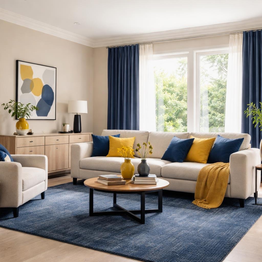
If you want contrast, use complementary colors—hues opposite each other on the wheel, such as blue and orange or green and red. Assign one as your 60% dominant color, soften the other as the 30% secondary color, and use a muted or deeper version as your 10% accent color. This keeps contrast intentional rather than overwhelming.
For a calmer look, choose a monochromatic color scheme. Use one base color and vary its shade and saturation. For example:
- 60%: light gray-blue on walls
- 30%: mid-tone blue sofa
- 10%: deep navy accent pillows
This approach creates depth without introducing competing hues.
Limit your palette to three or four related colors. Adding too many unrelated tones weakens the visual structure that the 60-30-10 ratio provides.
Inspiration from Fabrics, Artwork, and Trends
Let a patterned fabric, rug, or artwork guide your palette. These pieces already combine colors in balanced proportions, which makes them strong starting points.
Identify the dominant color in the item and assign it to your 60%. Pull a secondary shade for your 30%, often from upholstery, curtains, or an area rug. Then select a smaller, bolder tone for your 10% accent color, such as in cushions, lamps, or decorative objects.
For example, if your artwork includes cream, charcoal, and mustard:
- Cream becomes the 60% wall and large furniture color.
- Charcoal supports it at 30% through chairs or cabinetry.
- Mustard appears at 10% in throws or vases.
When referencing trends, apply them primarily to the 10%. This keeps your space current without requiring a full redesign when preferences shift.
Tips for Seasonal and Style Changes
Use the 60% and 30% portions as stable anchors. Keep them in adaptable neutrals or versatile hues that support multiple accent colors.
Update your 10% accent color to reflect seasonal changes. In spring, swap in soft greens or pale blues through pillows and florals. In fall, replace them with rust, olive, or deep plum in textiles and accessories.
If you shift design styles—such as from modern to rustic—adjust texture along with color. Maintain your 60-30 base, but reinterpret the 10% accent color with different materials:
- Modern: sleek metal and glass accents
- Rustic: aged wood and woven textiles
You maintain visual balance while refreshing your room with minimal cost and effort.
Real-Life Room Makeover Examples and Variations
You can apply 60 30 10 decorating to almost any room by assigning clear roles to walls, furnishings, and accents. When you adjust the proportions with intention, you create a balanced color scheme that feels cohesive rather than accidental.
Living Room: Balanced and Inviting Spaces
In a living room makeover, start with the largest visual surfaces. Walls, a large sectional, or a dominant area rug often account for the 60 percent base color.
For example:
- 60%: Warm greige walls and a matching sofa
- 30%: Navy armchairs and patterned curtains
- 10%: Rust throw pillows and a ceramic table lamp as the accent color
This structure keeps your eye moving without visual clutter. The base color grounds the space, while the secondary shade adds contrast through substantial pieces like chairs or bookcases.
Use the 10 percent intentionally. A bold accent color works best in small, repeatable items such as pillows, art, or vases. Repeating that accent at least three times strengthens the balanced color scheme and prevents it from looking random.
Kitchens, Bedrooms, and Beyond
In kitchens, cabinetry often dominates the 60 percent. If you choose white cabinets, they set the foundation for the rest of the palette.
You might break it down like this:
- 60%: White cabinets and backsplash
- 30%: Natural wood island and open shelving
- 10%: Matte black hardware and light fixtures
In bedrooms, bedding and wall color typically control the largest share. Soft blue walls can form the 60 percent, while upholstered headboards and drapery carry the 30 percent. Accent color appears in lumbar pillows, artwork, or a bench at the foot of the bed.
This approach simplifies your room makeover decisions. You assign clear percentages before you shop, which reduces impulse purchases that disrupt the color balance.
Variations: The 60-30-10-10 Rule and Breaking the Formula
You can expand the formula when one accent feels too limited. The 60-30-10-10 rule divides the final 10 percent into two smaller accent colors.
For example:
- 60%: Soft beige
- 30%: Charcoal gray
- 10%: Muted green
- 10%: Brushed brass details
This variation works well when you want layered depth without overwhelming the room.
You can also break the formula. Some spaces function better with a 70-20-10 split, especially in minimalist interiors. Two-color palettes may reduce the scheme to 60 and 40, with texture replacing a bold accent color.
Treat the rule as a framework, not a restriction. Adjust the percentages to suit your space while maintaining clear visual hierarchy.
Common Mistakes and Pro Tips for a Successful 60-30-10 Decor
You create strong results with the 60-30-10 rule when you control proportion, placement, and flexibility. Clear color balance depends on how you distribute your dominant, secondary, and 10% accent color across the room.
Avoiding Overwhelm and Color Clutter
You weaken color balance when you treat the rule as a license to add more colors. The formula works best with three intentional choices, not five competing tones.
Limit your color palette before you shop. Choose:
- One dominant color (60%) for walls or large surfaces
- One secondary color (30%) for furniture or large textiles
- One accent color (10%) for smaller details
Avoid introducing extra bold hues through impulse décor purchases. Even small items in unrelated colors can disrupt the 10% accent color and create visual clutter.
You also need to consider lighting. Natural and artificial light can shift how your dominant color reads, which affects the entire palette. Test paint and fabric samples in the actual room before finalizing your choices.
If the space feels chaotic, reduce contrast first. Simplifying one layer of color often restores balance faster than adding something new.
Distributing Accent Colors with Intention
You should not scatter your accent color randomly. The 10% accent color works best when you repeat it in three to five deliberate locations.
Use small-scale items such as:
- Throw pillows
- Artwork details
- Lampshades
- Decorative objects
- Trim or painted furniture
Spread the accent color across different heights in the room. For example, combine a pillow, a tabletop object, and a wall art detail. This approach guides the eye smoothly instead of concentrating all color in one corner.
Avoid oversizing accent pieces. A large accent chair can quickly shift the ratio and compete with your 30% secondary color.
If your accent feels too strong, soften it with texture rather than removing it. A muted fabric or matte finish keeps the color present without overpowering the space.
Ensuring Flexibility with Your Color Choices
You do not need to follow the 60-30-10 ratio with strict precision. Use it as a framework that supports thoughtful decisions, not rigid math.
If your room feels flat, adjust within reason. A 55-35-10 split can still maintain strong color balance. In some cases, you may introduce a second small accent, creating a subtle 60-30-10-10 variation, as long as the two accents relate clearly.
Monochrome spaces also benefit from this structure. Treat lighter and darker shades of the same hue as separate roles within your color palette. Assign the lightest tone as the 60%, a mid-tone as the 30%, and a deeper shade as the 10% accent color.
Keep your larger investments neutral when possible. You can update accent colors seasonally without replacing walls or major furniture, which keeps your design adaptable over time.
SHOP ON AMAZON
This post may contain affiliate links, which means I may earn a small commission if you make a purchase through them – at no extra cost to you. I only recommend products and services I genuinely trust and believe will add value to you. Thank you for supporting the blog! ♡ˎˊ˗


Leave a Reply